Style guide
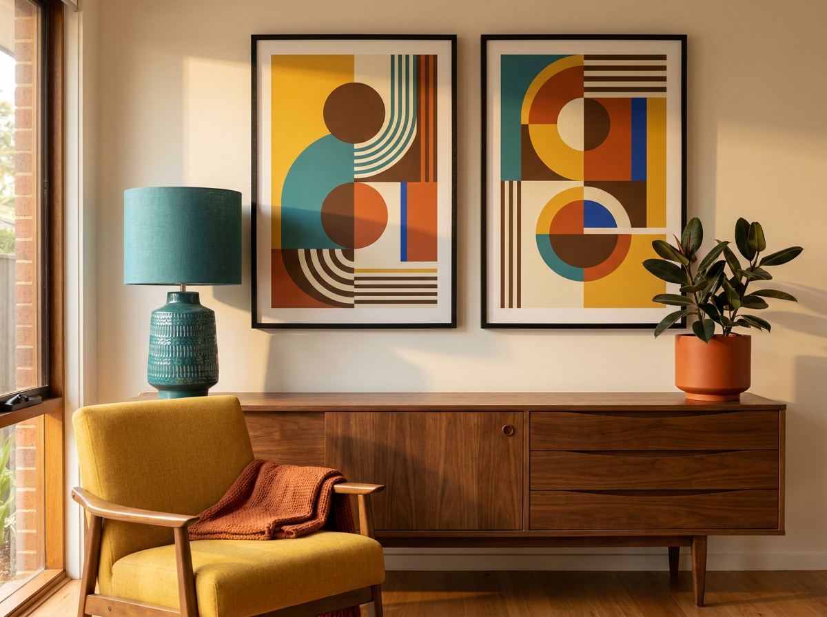
Confident shapes, and a very specific set of colours.
Mid-century is the easiest style to identify and the easiest to overdo. The line between a room that references it and a room that cosplays it is thinner than people expect.
The palette
These are the colours the style actually depends on. The artwork on this page is drawn in them.
Where it comes from
Roughly 1945 to 1965, driven by post-war optimism, new materials and cheap colour printing. The furniture names are the famous part — Eames, Saarinen, Wegner — but the graphic language came from elsewhere: Scandinavian textile design, Alexander Girard's work for Herman Miller, and the abstract poster art of the period. Flat colour, hard edges, no gradients, because that is what the printing technology of the day could do well.
What makes it that style
- Flat colour, no blending. Every shape is one solid tone with a crisp edge.
- Geometry with a curve in it. Circles, arcs, tapered legs, boomerangs — geometric but never rigid.
- Warm and cool held in tension. Mustard against teal, orange against navy. The clash is deliberate and it is the whole effect.
- Asymmetric balance. Weight distributed unevenly but resolved — never centred.
Which rooms it suits
Living and dining rooms, where the furniture can answer it. It is the strongest style for a large blank wall because the shapes read from across a room.
Framing
Walnut or teak frames if you have the wood elsewhere; thin black if you don't. Avoid ornate or gilt frames entirely — the style is a reaction against exactly that.
The mistake worth avoiding
Matching it too literally. If the print, the sideboard, the lamp and the cushions are all mid-century, the room stops looking designed and starts looking staged. The style was never meant to be total. Use it as one strong element in a room that is otherwise contemporary and it looks deliberate; use it everywhere and it looks like a showroom.
The look, in its own colours
Make one in these colours
A starting prompt for any AI image tool. Change the colours to your own room's and it becomes yours.
Mid-century modern abstract wall art, flat blocks of solid colour, hard clean edges, arcs and circles, asymmetric balance, no gradients or shading. Palette: bone white (#F0E7D6), mustard (#D98E32), teal (#2E6B6B), burnt orange (#B84A2E). No text.
Or use your room's actual colours
Photograph the room and the matcher writes the prompt from the colours in it — and shows you what it will look like once it is on paper.