Style guide
Boho is a palette before it is a pattern.
Most boho prints fail for the same reason: people copy the motifs and miss the colours. Get the palette right and almost anything works. Get it wrong and no amount of arches and moons will save it.
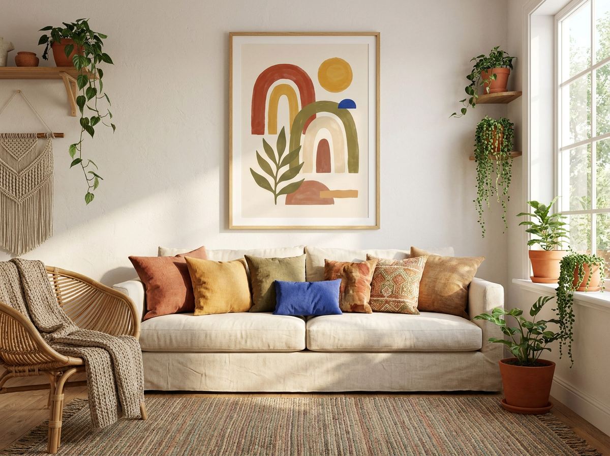
The palette
These are the colours the style actually depends on. The artwork on this page is drawn in them.
Where it comes from
Bohemian style borrowed its name from nineteenth-century Paris, where *bohémien* meant an artist living outside respectable society. The look we mean today is much younger — it comes out of 1960s and 70s counterculture, and specifically out of what travellers brought back from North Africa and South Asia: Moroccan rugs, block-printed cotton, macramé, unglazed terracotta. That inheritance is why the palette is what it is. These are dye and clay colours, not paint-chart colours.
What makes it that style
- Earth over brightness. Every colour looks like it came from soil, plant or clay. Nothing is fluorescent and nothing is cold.
- Warm neutrals doing the heavy lifting. Cream and sand usually occupy more of the picture than the accents do.
- Hand-made irregularity. Wobbly lines, visible brush marks, uneven edges. Machine-perfect geometry reads as mid-century, not boho.
- Arches, moons, sun rays, wavy horizons. The motifs are simple and repeat endlessly, which is precisely why the palette has to carry it.
Which rooms it suits
Living rooms and bedrooms, especially rooms with a lot of natural material already in them — rattan, jute, linen, unpainted timber. It struggles in a room of gloss and chrome, where the earthiness reads as accidental rather than chosen.
Framing
Pair with raw or pale timber frames rather than black. Black frames put a hard edge on a style built entirely on soft ones. Oak, ash and unfinished pine all work; so does a simple white frame if the walls are warm.
The mistake worth avoiding
Too many patterns competing. Boho tolerates a lot of texture and very little pattern conflict. If you already have a patterned rug and patterned cushions, the art should be the calm thing in the room — a single arch, a plain colour field, one line. The rooms that look like market stalls are the ones where three patterns are all shouting at the same volume.
The look, in its own colours
Make one in these colours
A starting prompt for any AI image tool. Change the colours to your own room's and it becomes yours.
Boho wall art, soft organic arch and sun shapes, hand-painted edges with visible brush texture, generous negative space. Earthy palette: warm cream (#F2EAD9), terracotta (#C0603F), ochre (#D9A441), olive (#7E8250). Matte, no gloss, no text.
Or use your room's actual colours
Photograph the room and the matcher writes the prompt from the colours in it — and shows you what it will look like once it is on paper.