Style guide
No subject means nothing to argue with.
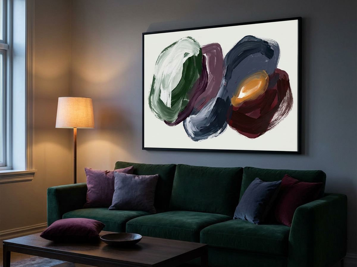
Abstract is the most forgiving art you can hang, for one structural reason: it has no subject, so it cannot contradict anything else in the room. That is also why it is the natural fit for matching to a palette.
The palette
These are the colours the style actually depends on. The artwork on this page is drawn in them.
Where it comes from
Abstraction as a deliberate programme starts around 1910 with Kandinsky, Hilma af Klint and Malevich, each arguing that a painting need not depict anything to mean something. The decorative abstract we see now owes more to what came after — Rothko's colour fields, Albers's nested squares, and the hard-edge painters of the 1960s. Those are the ancestors of nearly every abstract print sold today.
What makes it that style
- No recognisable subject. Shape, colour and balance carry the whole thing.
- Colour relationships rather than colours. How two tones behave beside each other matters more than either one alone.
- Composition you can feel before you read. Weight, tension and balance land immediately, which is why abstract works at a distance.
- Enormous range. From three flat blocks to dense gestural paint — 'abstract' describes what it isn't more than what it is.
Which rooms it suits
Anywhere, genuinely. It is the safest choice for a room you are unsure about, and the best choice for a room with a strong existing palette you want echoed rather than matched.
Framing
Whatever the room already uses. Abstract is frame-agnostic — which is a real advantage if you own frames already and would rather not buy more.
The mistake worth avoiding
Choosing on colour and forgetting scale. Because the colour matching is so satisfying, people stop there. But an abstract with three large shapes needs size to work — shrink it to A4 and the shapes become fussy detail, which is the opposite of the intent. Dense, detailed abstracts can go smaller. Bold, simple ones cannot.
The look, in its own colours
Make one in these colours
A starting prompt for any AI image tool. Change the colours to your own room's and it becomes yours.
Abstract wall art, three or four large flat shapes, confident asymmetric composition, generous negative space, matte finish. Palette: chalk (#F6F2EA), rust (#B85C38), deep blue (#33566B), ochre (#D9A441). No subject, no text, no frame.
Or use your room's actual colours
Photograph the room and the matcher writes the prompt from the colours in it — and shows you what it will look like once it is on paper.